Pantone Colour of the Year 2026: Cloud Dancer

December: it's time to see if we love or loathe the Pantone Colour of the Year for 2026.
Welcome to Pantone's Cloud Dancer (PANTONE 11-4201)

Pantone has announced Cloud Dancer (PANTONE 11-4201) as its Colour of the Year for 2026, marking the first time a soft white has taken the title. Yes, white. It's caused some raised designer eyebrows and here we take a look at what the colour can do for interiors.
Pantone describes Cloud Dancer as “a billowy, balanced white imbued with a feeling of serenity” and explains in its Colour Insider release that the choice reflects a collective need for calm, clarity and spaciousness in both life and design. The marketing spiel continues that 'Cloud Dancer is positioned as a hue that represents breathing room, simplicity and a shift towards intentional living. It captures the idea of stepping away from visual overload and embracing quiet refinement...a structural colour that whose versatility provides scaffolding for the colour spectrum.'
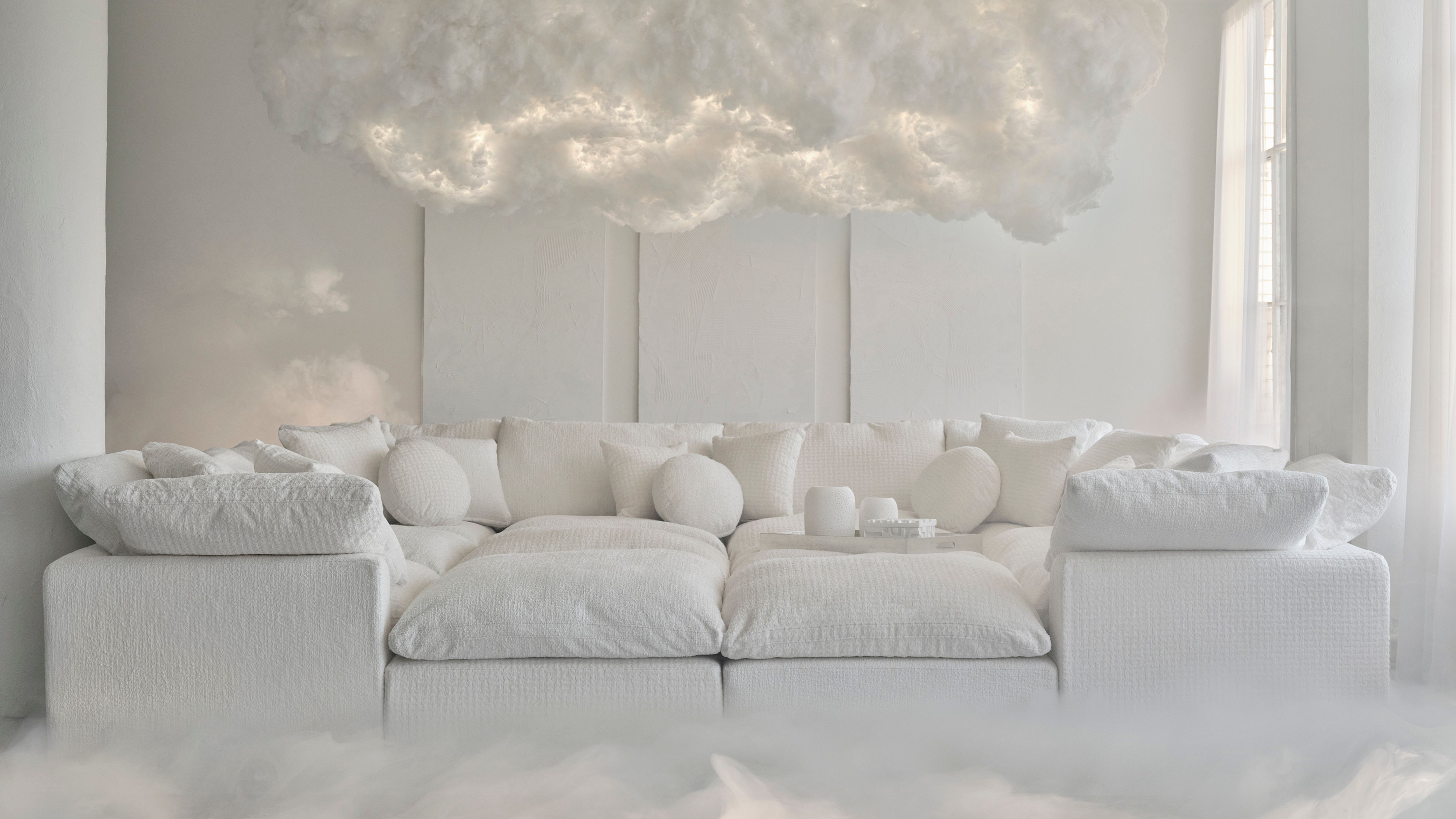
From an interiors perspective, Cloud Dancer lends itself naturally to calm spaces, architectural detailing and layered tonal schemes. Its balanced undertone avoids feeling too cold or overly creamy, making it a versatile base colour for many design styles. Whether used in contemporary minimalism, relaxed coastal schemes or softly luxurious bedrooms, it provides a gentle backdrop that allows materials, textures and accent colours to stand out. It looks a very useful white and now that we are all used to selecting our colours carefully as a collective, we can see this one working well with existing schemes and future plans.

Backlash and Press Reaction
Despite all this positive framing, Cloud Dancer has been met with significant criticism in the design press and on social platforms with several commenting that it feels 'uninspired', 'sterile', 'unadventurous', a 'step away from creativity' to name a few. While these interpretations vary, they underline the contentiousness of choosing a neutral tone as a symbolic colour for an entire year and a 'colour' that that we have forgotten is a colour.

Using Cloud Dancer
Cloud Dancer seems to us to be an easy colour to work with; looking at Pantone's palette suggestions, the warmer undertones sit well with the blues, browns and neutrals that are dominating interior schemes at the moment.


Pairing Cloud Dancer with natural materials such as warm oak, rattan, in a boucle, wool fabric or textured stone prevents the shade from feeling too clinical.
Introducing richer accent colours - deep teals, smoky greens, terracotta, burgundy or soft blush tones - allows the space to feel grounded and personal.
Using Cloud Dancer on ceilings, cabinetry, trims or bespoke carpentry is another refined way to bring the hue into a room without washing the space in white.


What This Debate Means for Designers and Homeowners
So why white? Pantone for the past 26 years have nudged designers of everything from fashion to homewares, cars to packaging and the mixed reaction to Cloud Dancer highlights an important truth: even a neutral shade can provoke an emotional reaction. A soft white may seem simple on the surface, but it highlights that getting the right shade of white, is all in the detail.


Layer texture generously
Soft linens, wool, boucle, timber and woven finishes bring warmth and depth, preventing the space from feeling sterile.
Balance with warmth
Natural wood, warm metals and earthy accents help ground Cloud Dancer and keep it inviting.

Let colour be intentional, not absent
Cloud Dancer holds space beautifully for muted pastels, deep blues, greens, terracottas and inky tones. It doesn’t remove colour — it frames it.
Use it where calm matters most
Bedrooms, living rooms, reading corners and home offices benefit most from Cloud Dancer’s quiet, grounding quality. And look out for branded Pantone collaborations - these Post-It notes look set to become a stylish staple.

Conclusion
Cloud Dancer may not be a bold or expected choice, but it does stop and make you think about colour so it does what Pantone intended; it introduces that moment of pause. While the shade has provoked debate, it also invites thoughtful design, offering an opportunity to create interiors that feel calm, spacious and deeply personal. And that's colour, it's personal reaction and a choice we make to bring into our living and working spaces.
Cloud Dancer looks to become far more than a simple white, it looks to be a welcome canvas for creativity, meaning and modern living.

Image Credits: all www.Pantone.com